From Sketch to Brand System: Boxpark Sushi
Logo design and brand-guide development
From hand sketches and custom lettering to a complete brand guide, Boxpark Sushi became a distinctive and practical identity system.
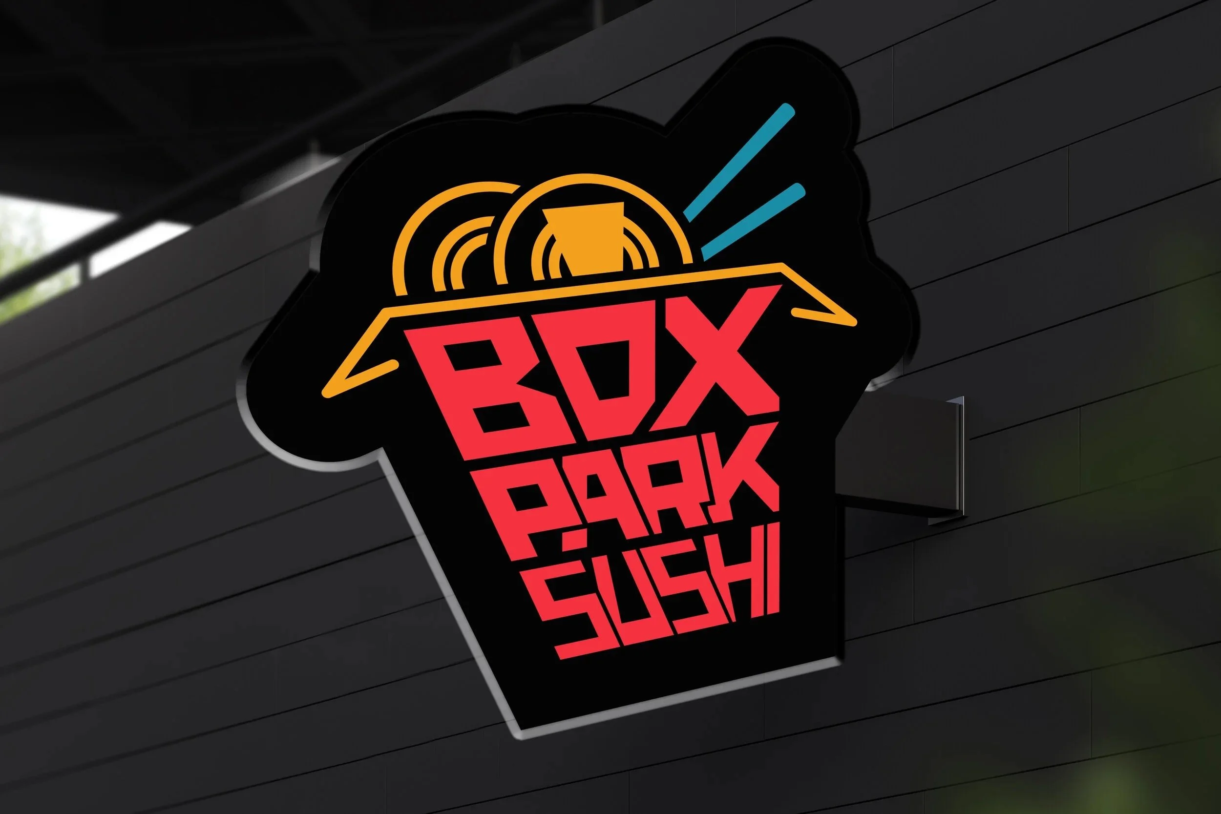
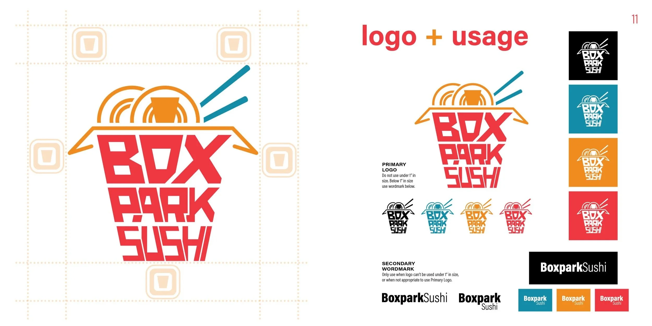
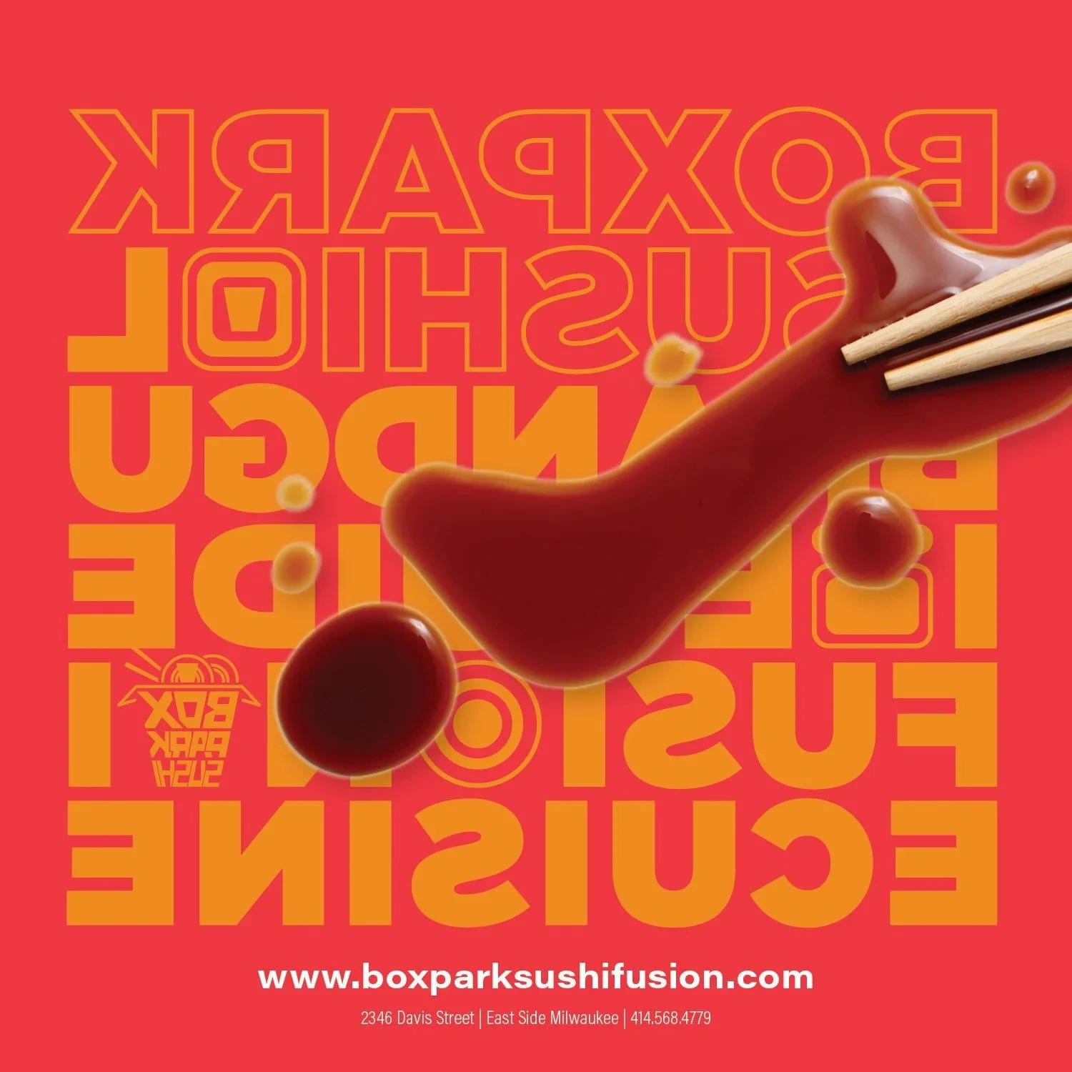
The identity began with a simple idea: use the shape and negative space of a takeout box to contain the name. I explored the mark through sketches, measured line drawings, and digital refinements. A system font made the logo feel generic, so I returned to pencil and paper and developed custom letterforms one character at a time, shaping how each letter fit within the box and interacted with the next.
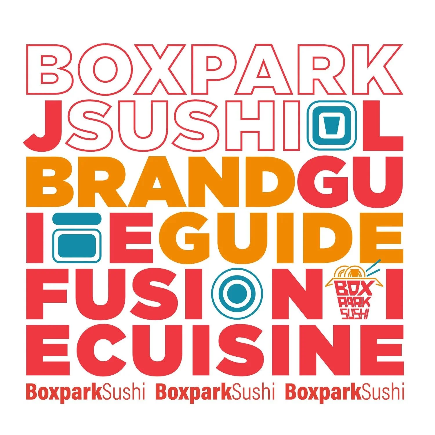
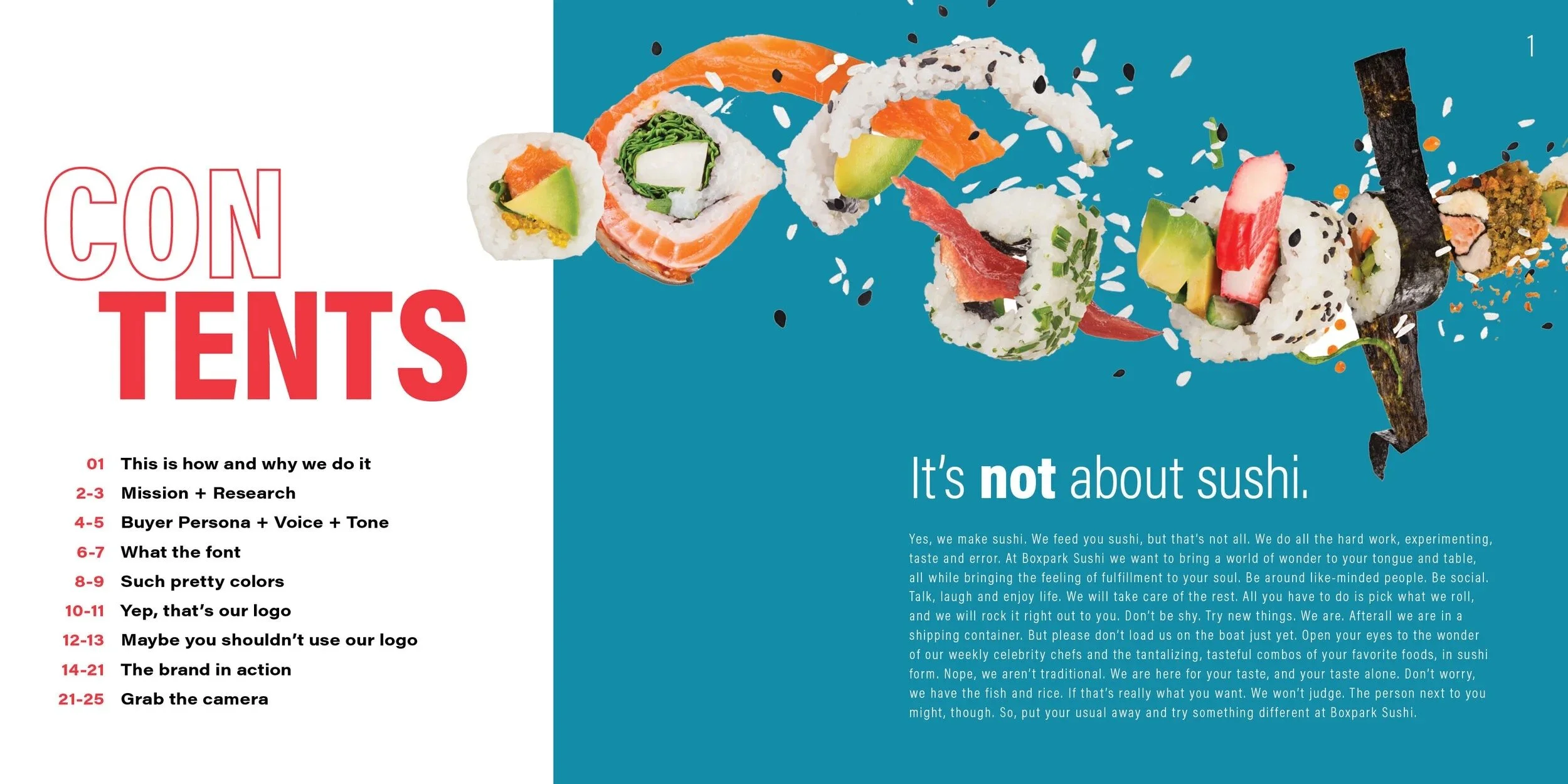
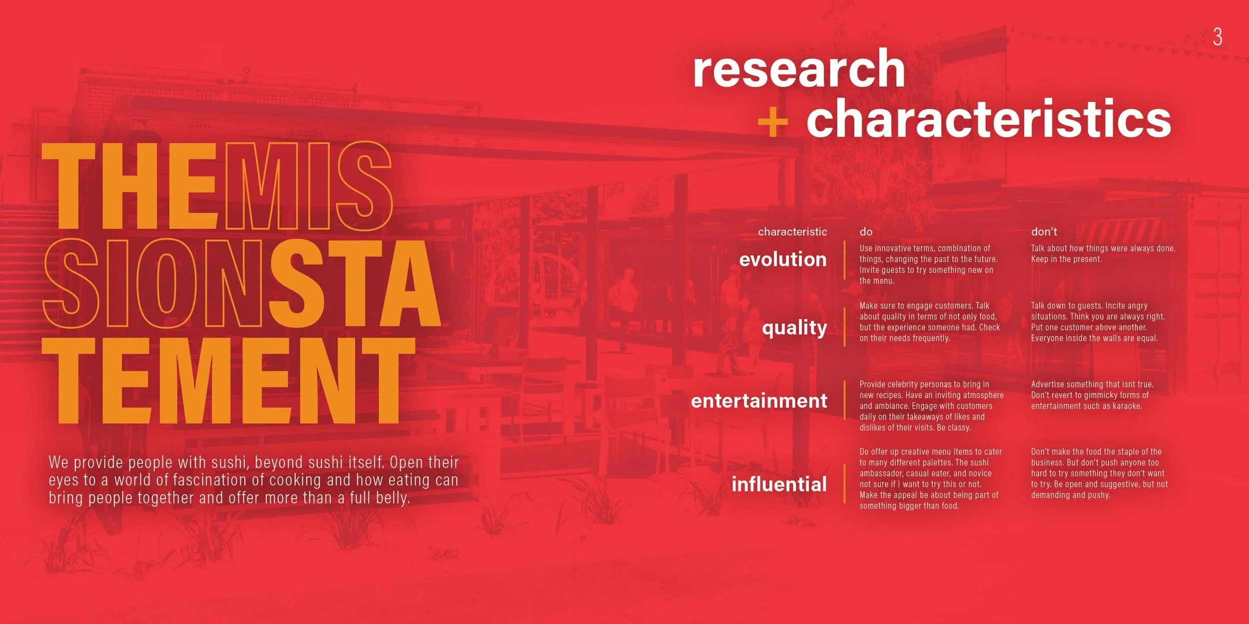
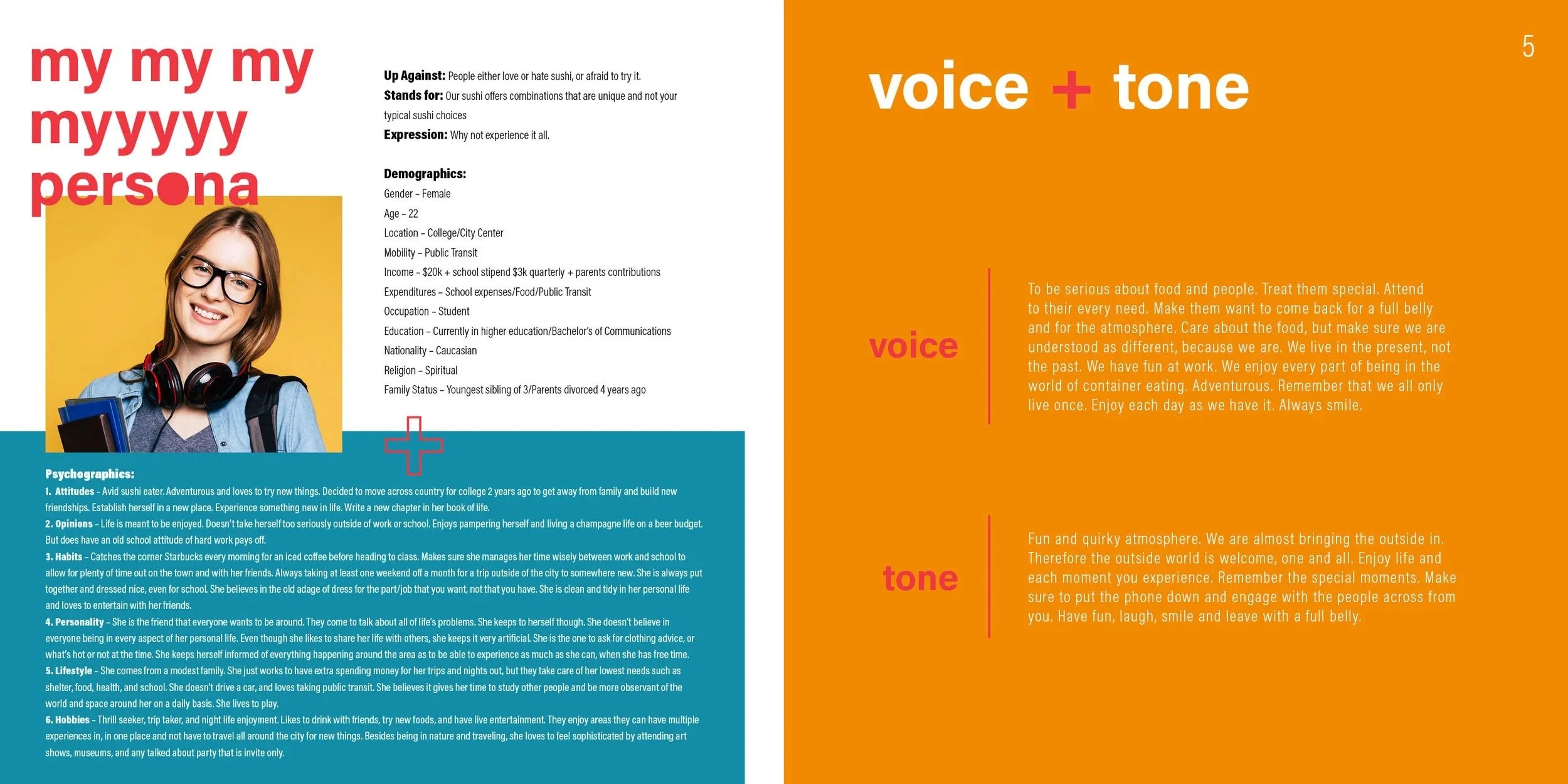
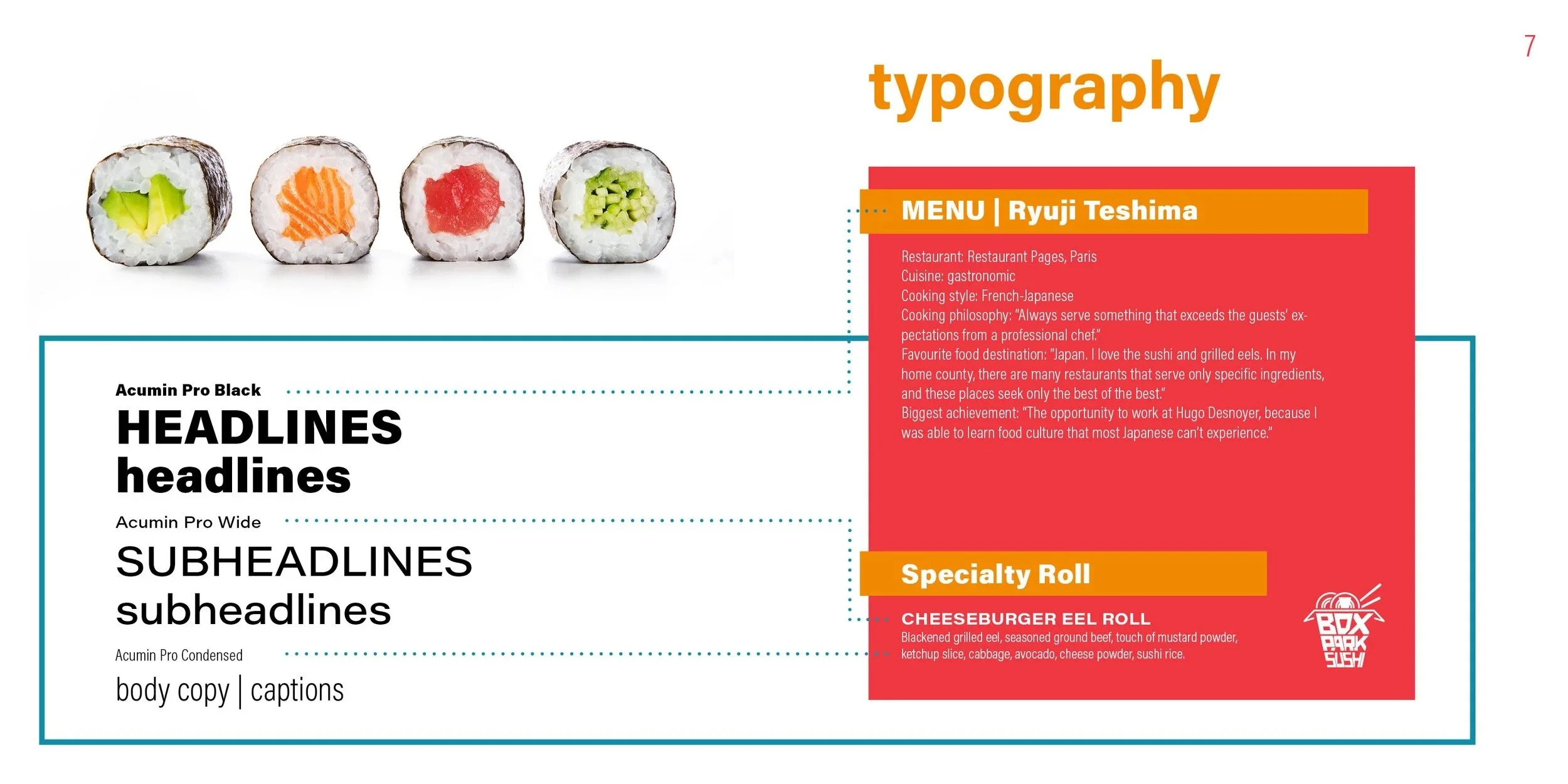
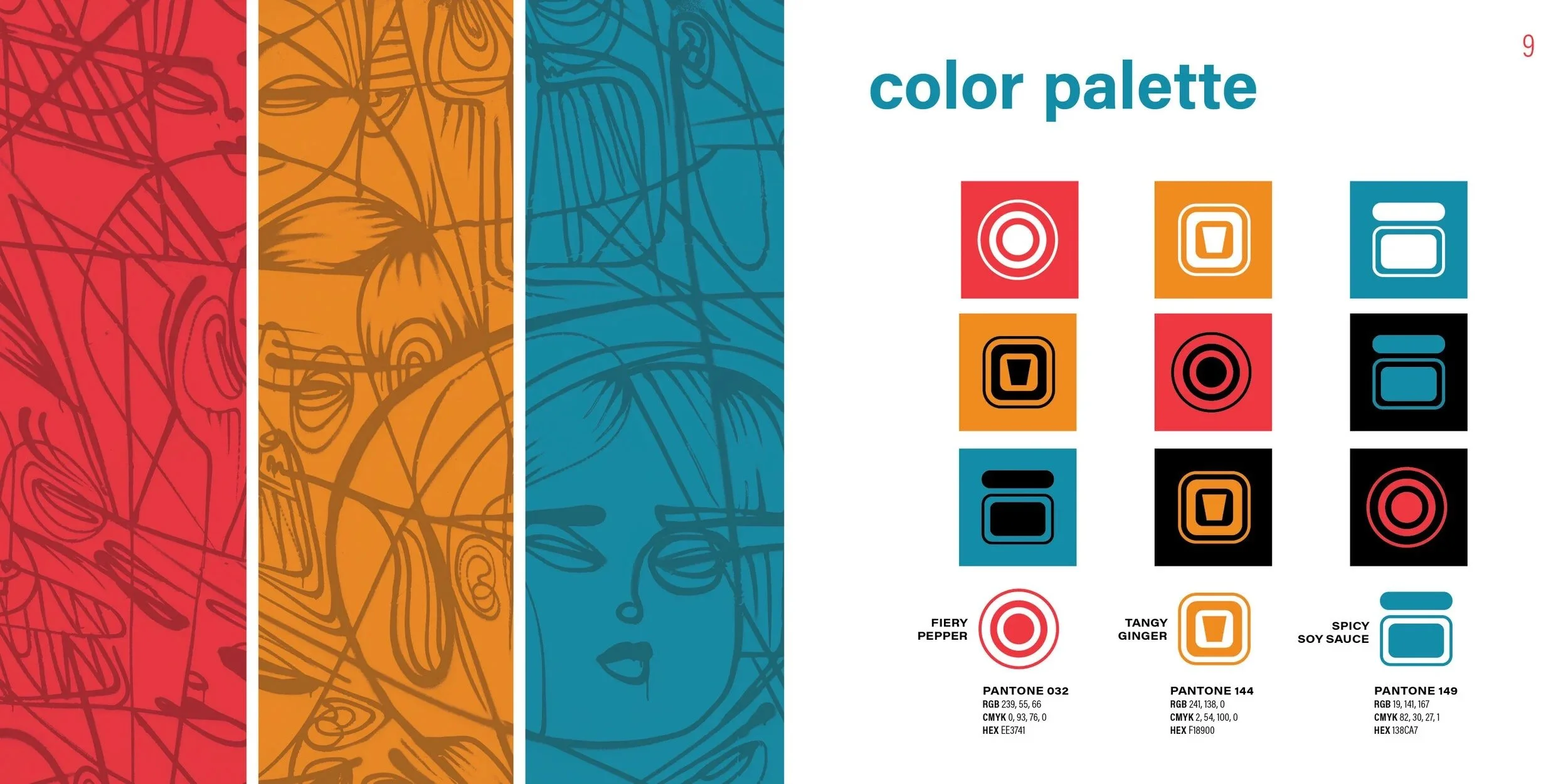
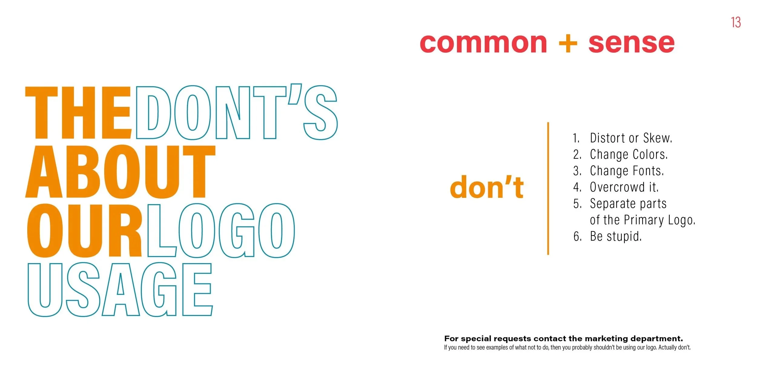
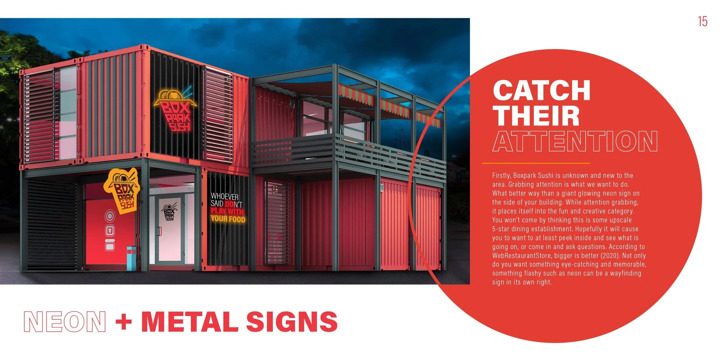
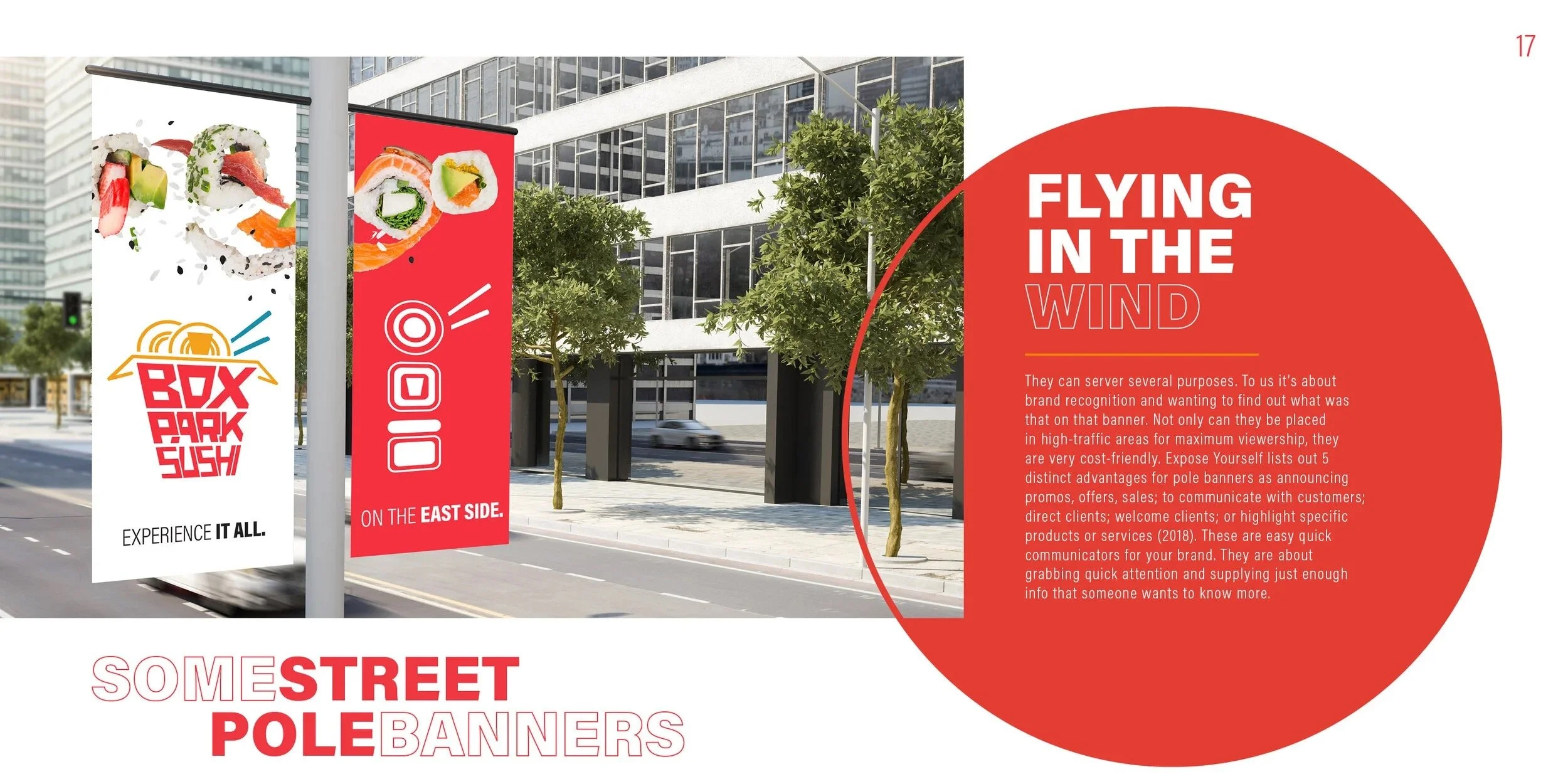
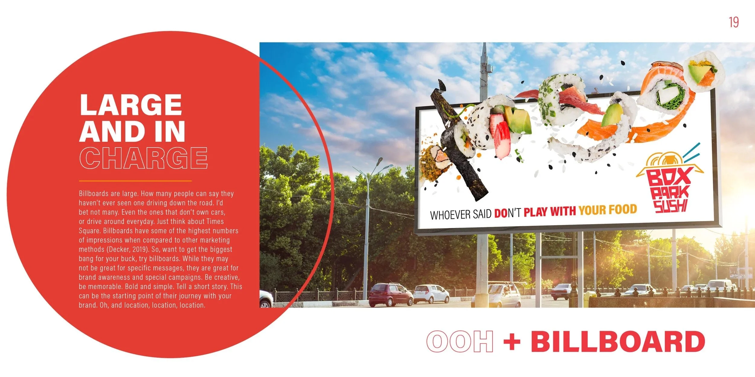
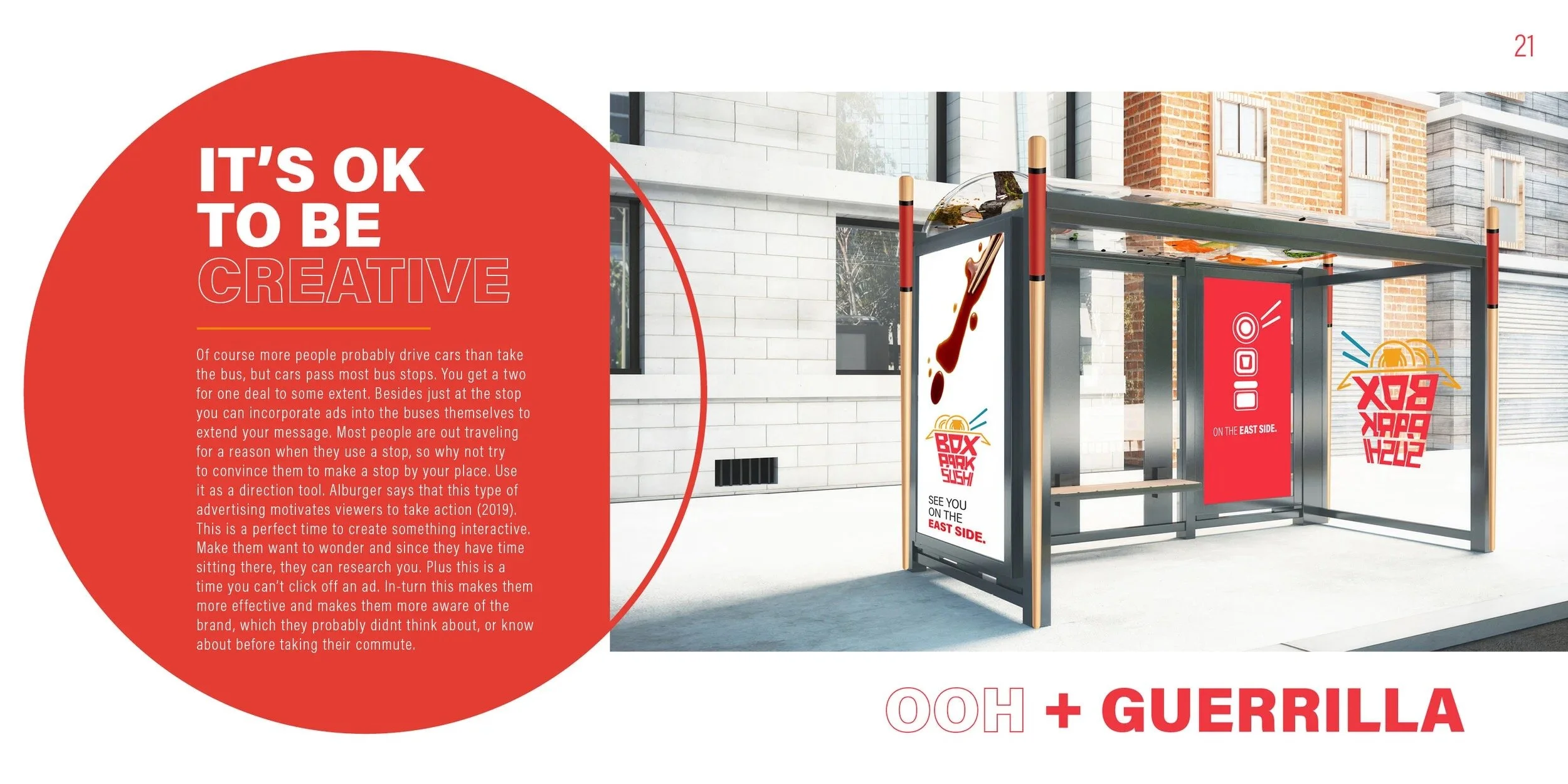
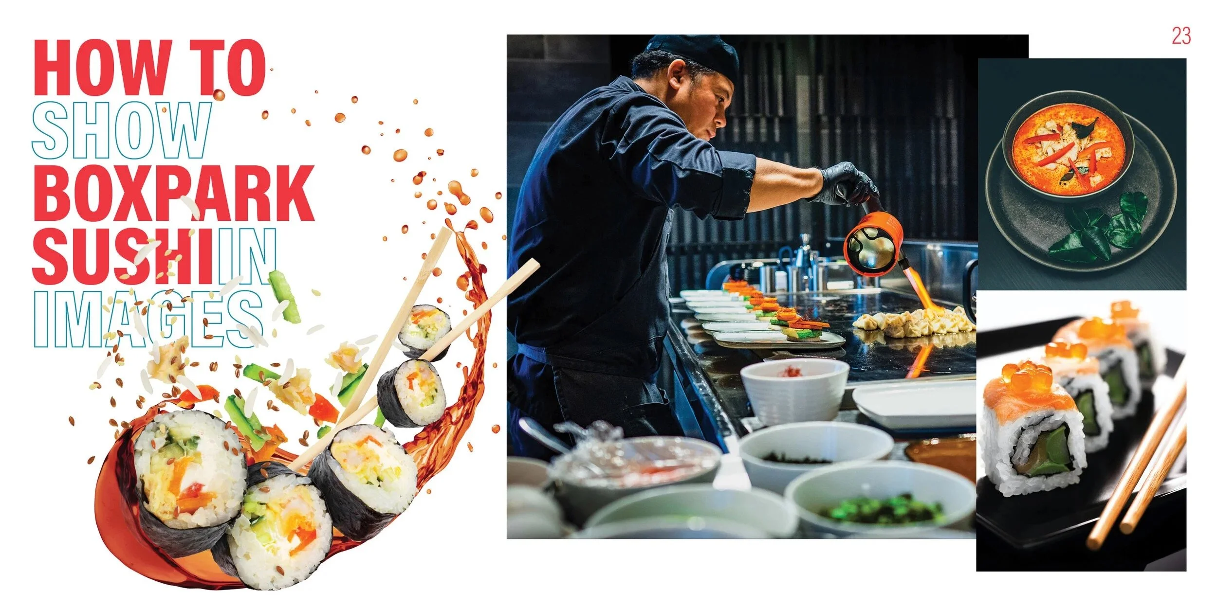
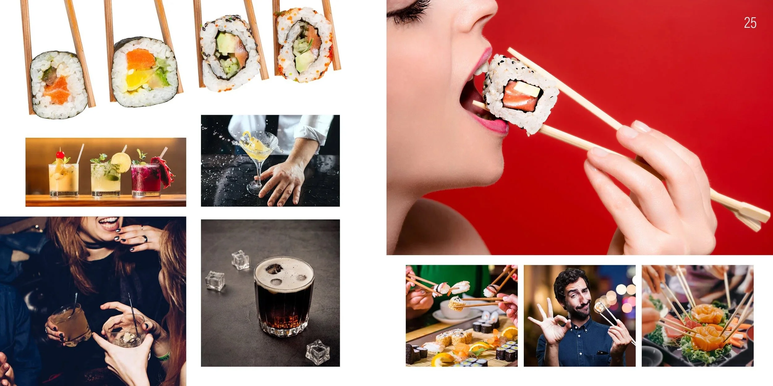
I extended that thinking into the brand guide. Early versions leaned too heavily on the vision board and did not provide enough practical direction. By testing the identity in real applications, I refined the guide into a clear communication tool that explained how, when, and why to use the brand and its core visual assets.